Project 1a: Charts and Graphs
The purpose of this project is to utilize varying types of charts and graphs to visually display a series of facts. For my data source, I chose the most successful of discount airlines, Southwest Airlines. Southwest has been the best performer in the whole airline universe over the last twelve years. The following histogram shows Southwest’s performance since 1988.
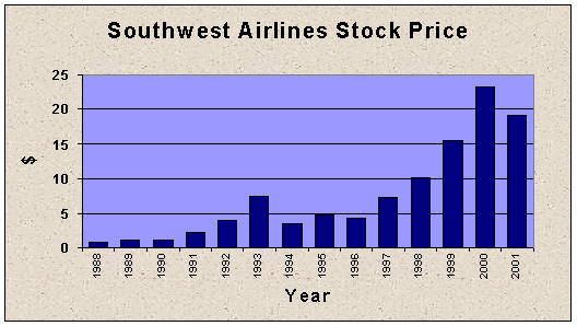
In 1988, the stock price (split adjusted) was $.86. By 2002, the value had grown to $19.11. (The values are from December 31 of each year.) From 1988 to 90 to stock was stagnant. 1991 to 93 stock gained over 200% ($2.19 to $7.43). Following a re-trenchment and another stagnant period, the stock gained another 400% from 1996 to 2000. Due to the recession and terrorist attacks in 2001, the stock lost ground. 2002 should be another year of growth for the stock.

Utilizing the bar chart below, the stock performance seems even more
impressive.
Another way to view the performance of Southwest is by a scatter plot.
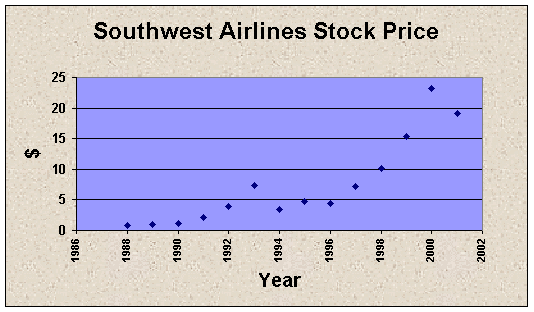
A scatter plot is a tool to show trends or correlation. With this stock the trend is pretty evident. But, the scatter plot seems to bring the upward performance into a better light.
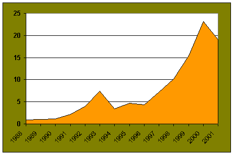
Colors can also visually bring out a point. In the below example, using a time series plot in conjunction with vivid colors dramatically shows the upward progression of this particular stock.
As anyone familiar with the airline industry is aware, the industry is very
competitive. Carriers strive to maintain
and build upon their market share. The
following pie chart graphically shows the market share of the major carriers,
measured by domestic revenue as of
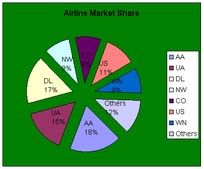
(AA=American Airlines;
UA=United Airlines; DL=Delta Air Lines; NW=Northwest Air Lines; CO=Continential
Air Lines;
US=
As presented, the domestic market for air travel is
dominated by the "major" airlines with seven carriers controlling 88%
of revenues. But what is more striking
is the fact that the "Big Three" of American, Delta and United
controlled half of all the revenue generated in the